Hello everyone! I am back today to bring you a rarely discussed topic in MTG finance, card artwork. Part of this is because art is very subjective. As you know many Magic cards have various printings. Some have different borders, rarities, and artwork. All of these components tend to have varying effects on the prices among different printings of the same card. So today I will be discussing how otherwise similar cards having different artwork can affect price in a big way.
Many of the best artwork on cards are on the original version. While this is my opinion, I’m here to show you the price often reflects that. While that isn’t always the case, I find that more often than not, the older artwork is superior. We know that the original printing of cards tend to fetch a slightly higher price than any reprints do. However, we can also see cards with the same artwork that are reprinted have prices very close to each other. Many cards boast the same or less than 5% price difference when the versions share the same art. This even applies to cases where one has a much smaller print run or wasn’t opened as much.
Some examples of cards that have been reprinted years after the original but containing the same artwork are:
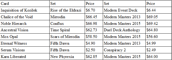
Notice anything about these prices? The prices of the reprints are right in the same ballpark as the originals. Basically, the demand to have one version of these cards over the other is so small, that there isn’t a profound price difference even where the original has far fewer copies in circulation.
Additionally, many cards that have been reprinted with different artwork have similar prices. I have found that when the quality of artwork is relatively similar, two different versions of the same card tend to only have small price differences. In other words, if the player base is relatively split when it comes to artwork preference, the prices synchronize.
Some examples of this would be Goblin Guide, Engineered Explosives, and Vendilion Clique. The prices for these between their different sets and artworks is relatively consistent. In my opinion, this can be attributed to a lack of one artwork being vastly superior to its counterpart.
Today, I will be discussing cards whose prices do differ significantly. The most likely reason for these price differences in my opinion is the artwork. In some cases, the old frame versus new frame may cause a bit of the price difference, but for me, the true appeal of these cards is the artwork.
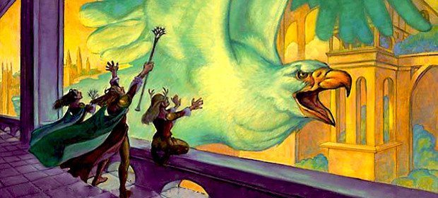
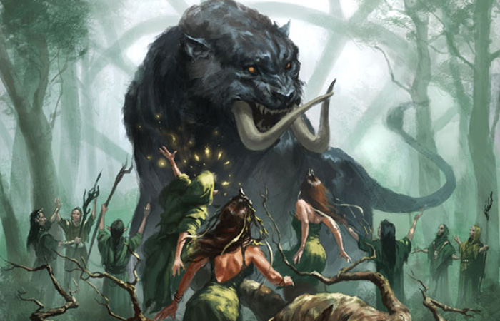
I absolutely love the original Ravnica Chord of Calling. The way Heather Hudson uses the colors for the lighting and the focus on the giant bird are more pleasing to the eye than the M15 version. The M15 Chord comes off somewhat jumbled and confusing and I do not get the whole “I am summoning a sweet creature” vibe from it.
While both cards have a post-8th Edition frame, the Ravnica version commands roughly a 33% higher price tag. The price of the foil Ravnica version is three times higher than the M15 as well. This goes to show that when players are choosing how they want to search out their toolbox creatures in Modern and EDH they are willing to shell out a few extra dollars for the beautiful colors of the original printing.
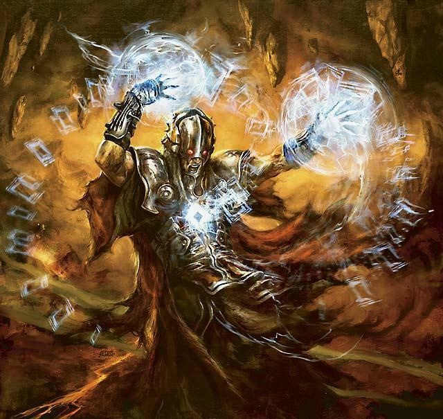
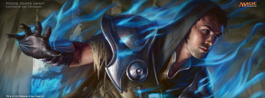
Venser is one of my favorite blue cards of all time. When he isn’t putting work in cube, he can be found smashing face in competitive and casual EDH alike. Just missing the bar of playabilty in Modern, it’s these casual formats that caused this amazing tempo creature to soar in price before being reprinted twice in recent years.
While I do like the blue colors in the newer Venser, the original Future Sight artwork is just so iconic. Future Sight commands the highest booster box price tag of all Modern-legal sets and Venser is right there on the box artwork as the focus. You can buy an entire playset of Modern Masters 2017 Vensers for the price of ONE Future Sight original version. And when it comes to foils, the newer version could buy you exactly one Chipotle burrito. A Future Sight Venser however, could buy you one burrito per day for a whole week. Because both Vensers have the post-8th Edition frame and rarity, it can only be surmised that the artwork plays a huge role here. I absolutely agree, you can’t beat Aleksi Briclot’s amazing artwork here and we will see another of his iconic works later.
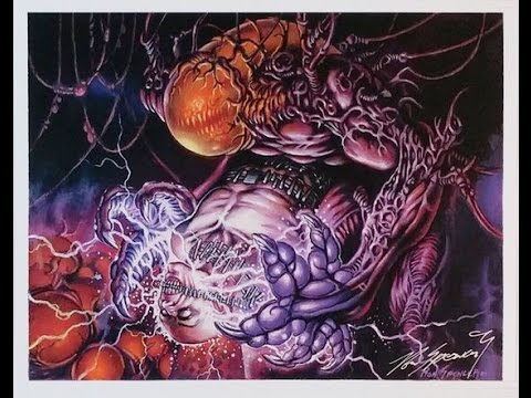
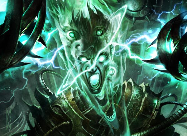
Cabal Therapy may be the only uncommon on my list, but it has certainly earned its spot. The original Judgment printing is worth double it’s recent Eternal Masters counterpart. You could also buy two playsets of pack foil Cabal Therapy from Eternal Masters for the price of ONE Judgement foil. Now, some of this can be attributed to some preferring the old border compared to the new, but that’s not the end of the story.
The original artwork for Cabal Therapy was created by the talented Ron Spencer well over a decade ago and the artwork really speaks to me. I was actually shocked to see the original artwork of this piece change hands a couple years back for under $2,000. Nothing against the newer artwork, but the two are light and day to me. I could never part with my playset of Judgment Cabal Therapy and combined with the old border, there’s no other way to go.
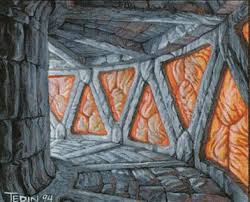
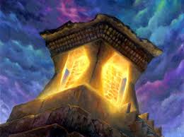
Just because you flip a coin for Mana Crypt doesn’t mean you should leave your artwork selection up to chance. The original Mark Tedin artwork for this powerful Vintage, Cube, and EDH staple evokes what I feel to be subtle ominousness. It looks so quaint, but complicated. Unwelcoming, yet fascinating. I always wanted to see what lies beyond that corner. Sometimes, I imagine that there are two wizards waiting there right around the bend, where the light source is coming from. One has a gift of mana for you, the user, waiting eagerly to provide aid when you reach for your Mana Crypt. The other wizard has a spear ready to offer you, stabbing you in your side when you reach to the crypt.
Anyways, my crazy fantasies aside, the price difference between the media promo version (which happens to be the original) and the new Eternal Masters Mana Crypt isn’t a figment of your imagination. The original crypt will set you back about 40% more than the newer one, so for those of you with many Commander decks, you could buy three new ones for the price of two old ones. I do believe the very handsome old border plays some part of this massive price difference, however you can’t discount the artwork when comparing the two. Since you are expecting the crypt to stick around on the board as long as you are, I would absolutely choose the original.
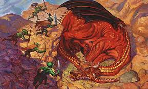
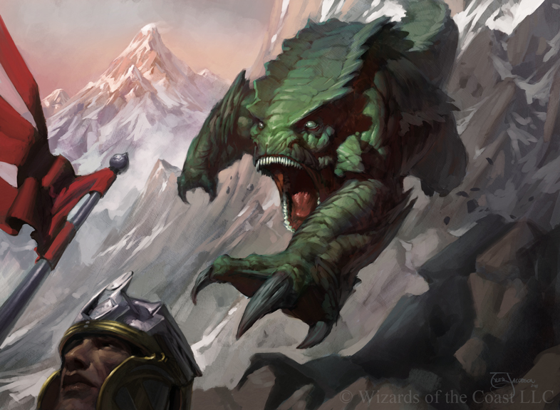
Surprise, you’re dead! That’s what happens when you allow a Sneak Attack to resolve these days in EDH or Legacy. With the power creep of creatures over the past decade, Sneak Attack’s stock has risen quite sharply and it even finds itself the focus of a few Legacy decks. While it was recently reprinted in Eternal Masters with different artwork, the original from Urza’s Saga commands a 33% premium over the newer version. This is even despite an upshift from rare to mythic rare.
Now there is quite some allure to the older border when it comes to Sneak Attack. I absolutely love the old red border magnitudes above the post 8th Edition border. But by far, the biggest selling factor for Sneak Attack is its artwork. Illustrated traditionally by Jerry Tiritilli, the artist for Rishadan Port, the colors and movement of the piece are absolutely stunning. Goblins teaming up and attacking a dragon beat some kavu attacking a random soldier any day for me. The Urza’s Saga version sticks out on the field quite vibrantly, despite me always grumbling when it is played against me. The masterful artwork combined with the amazing flavor text on the original means we certainly have a winner, and the price reflects that.
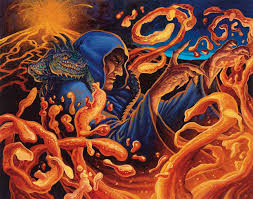
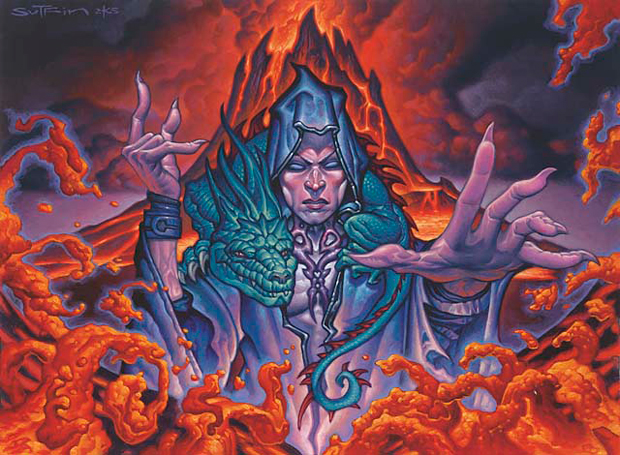
Red players eat your heart out! If you have respect for the color red you will use the original Torment version of this amazing 1-drop. There are very few red artworks in all of Magic that beat out Grim Lavamancer to me. Jim Nelson hit it out of the park with the original art from 15 years ago. The blue of the lavamancer’s cloak contrasts the reds and oranges flowing from his hands. The facial expression on the lavamancer himself and the Obstinate Familiar on his shoulder really set the callous red player’s mood.
When it comes to pricing, it seems that most players agree with me. Non-foil Grim Lavamancers from Torment are priced around 40% more than their M12 counterpart. For the price of a single foil copy from Torment you could buy ten foils from M12. I cannot speak poorly of Michael Sutfin’s amazing artwork either, as he is also the illustrator of Sensei’s Divining Top, Vendilion Clique, and Exalted Angel. However, when it comes to this lavamancer, any choice other than the original would be grim.
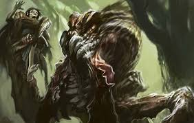
“Ach! Hans, run! It’s a very price inflated version of the lhurgoyf!”
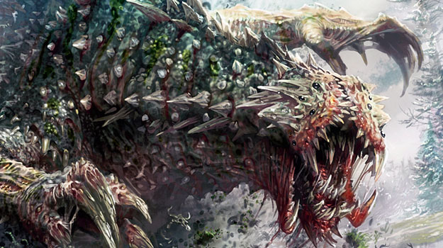
Surely everyone reading this has heard of Tarmogoyf. At one point it was the most expensive creature in all of Magic, even beating out Imperial Recruiter and Juzam Djinn. Thanks to recent reprintings, the mighty Tarmogoyf has shrunk in price to an affordable… $300 per playset. Well that could buy you the cheapest playset out there. If you want to play your goyfs in style, you will have to shell out closer to $500 for a playset of the Future Sight version. A this point, Tarmogoyf has been printed four times and I suspect that number to rise to five by 2019. Foil Future Sight Tarmogoyf is one of the most expensive foils in all of Magic. Commanding more than some Beta dual lands should be an indicator of how coveted the premium version of this powerful creature is. It would be cheaper to acquire a playset of foils from any other set than shell out for a single copy of this extremely rare foil. There are two reasons for the huge price difference between versions.
The most obvious reason that sticks out, is the border. I would wager that on my list, the card that has the most contribution to its price from its border is Tarmogoyf. The amazing and unique Future Sight border that appeared on “future shifted” cards hasn’t been replicated since, and players do jump at the chance to throw them in their deck. We see this with other cards like Street Wraith, Narcomoeba, and Bridge from Below. I absolutely love this frame as well and can certainly see it contributing to the price difference.
However, let’s not forget that Tarmogoyf was upshifted to mythic rarity when it was reprinted in all three Modern Masters sets. Because the original version is simply a rare, we must attribute another factor to its price premium. The artwork for Tarmogoyf certainly plays a factor here. I will admit, the original artwork for Tarmogoyf is peculiar. It was produced by an artist who was given one other card and never illustrated for MTG again. Calling Tarmogoyf’s artwork a masterpiece would certainly be pushing it. “Iconic” is more aligned with how I feel when I see a Future Sight Tarmogoyf. The artwork actually looks amazing when combined with the border, something few other cards can boast. Immediately recognizable and always sizeable, it leaves me and many others hungry for the original.
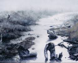
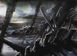
I was tempted to put all five original Onslaught fetchlands here on the list but decided that I would just do my favorite, Polluted Delta. You can’t beat a traditional Rob Alexander landscape painting and it isn’t remotely close when compared to the Khans of Tarkir version. Polluted Delta is one of my favorite artworks of all time and it is absolutely one of the top 10 most powerful lands ever printed to boot. The colors Rob uses to illustrate a very calm but tainted scenery are perfect and this artwork will always command respect from me. Also the Khans version has flavor text. Ew.
The Onslaught version is about 40% more expensive than the Khans version and for good reason. Did I also mention the 700% difference in price between the two pack foils? That insanity partly comes from the amazing old border but you gotta hand it to the artwork as well. It is a display of good taste to use original Rob Alexander fetchlands from Onslaught, but those aren’t the only of his works you should pay a little more for…
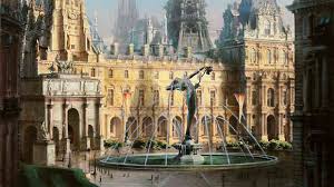
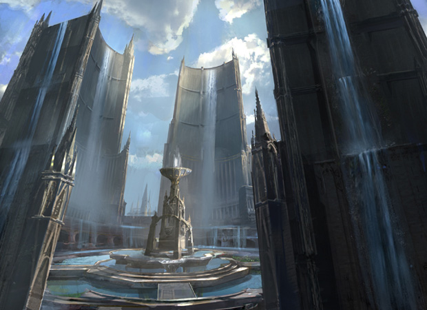
Number 2 on this list shouldn’t come as a shock to anyone but I chose the Ravnica shockland cycle. Just like the fetchlands, I decided to focus on my favorite one of the bunch rather than dive into the set of 10, but for artwork the original 10 are vastly superior on each count.
Hallowed Fountain is one of the best pieces of artwork for the game, hands down. The amount of detail and intricacy in the artwork isn’t seen in the rest of the game, old or new. The size and scale of the piece is remarkable and the use of shadows and details makes it quite stunning. Mr. Alexander strikes again and it is always nice to be able to use a fetch by Rob to grab a shockland by Rob.
As for the price, you are going to pay roughly double for the original Dissension version over the Return to Ravnica edition. The foil version of the original is worth roughly 550% more as well. That means you couldn’t even buy a single copy of a Dissension foil for the price of a playset from Return to Ravnica. Both versions have the exact same border and the exact same set rarity, so the artwork seals the deal here.
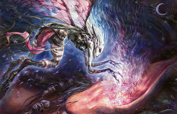
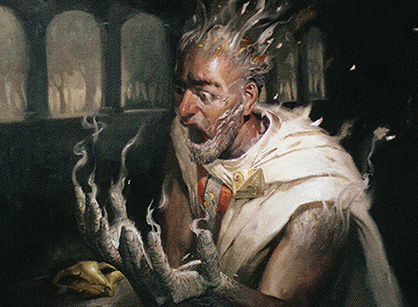
The moment you have all been waiting for, the number 1 spot. Thoughtseize was the main card that inspired me to write this article in the first place. I found the difference in artwork quality so vast and the playability of the card so frequent that I had to bring up the discussion.
Thoughtseize from Lorwyn is illustrated by the talented Aleksi Briclot and captivated everyone from the moment it was printed. Don’t let the beauty and elegance of the colors fool you, getting Thoughtseize’d is no fun at all. One of the most powerful plays in Modern, Legacy, and sometimes Vintage, it would behoove a player to have the best artwork of the card. After all, it often sits there, glaring your opponent in the face taunting them, as you write down the contents of their hand. Might as well give them something nice to look at.
The original Thoughtseize from Lorwyn is worth about double the Theros version. When it comes to foils, things get crazy. Lorwyn Thoughtseize foil versions have really been shaken up lately on the market and the prices have been fluctuating between expensive and very expensive. Currently, an original foil Thoughtseize will set you back close to $600, while a Theros foil goes for around $45. Considering both cards have the same set rarity and border, it is another clear indicator of artwork superiority.
And that concludes my list of cards that demand premiums based on their superior artwork. There were many cards that I felt missed the list not on their merits but because rarity shifts had too important a role in their price. For instance, Snapcaster Mage from Innistrad is worth roughly the same as the Snapcaster Mage from Modern Masters 2017. I believe the original artwork far outshines the reprint, but the price hasn’t reflected that yet due to the upshift in rarity. The same goes for Vampiric Tutor from Visions and Eternal Masters.
I hope you enjoyed reading about these amazing pieces of Magic history as much as I enjoyed gathering them. I hope we see a new direction of artwork, calling back to days long gone in the future. What are your favorite versions of popular cards? Do you prefer the newer art style or the old? Feel free to let me know in the comments!
Rachel Agnes is a VSL Competitor, Phyrexian Princess, Collector of all things shiny and a Cube, Vintage, Legacy, and EDH enthusiast.
Catch on Twitch and Twitter via Baetog_.

Fun Article! Though I may disagree i like some of the new art even better!
Hey thanks for commenting! Glad to hear that you liked it. Which cards in particular and what do you like about them?
You really can’t say the rare or mythic slot being the same is the only factor and therefore the art is the only other reason things cost so much more for the “original” art. The print runs for the newer cards are much much higher and I’m sure have some impact on the prices, foil or not.
While print runs DO have an impact there has to be a serious demand for one version over the other to affect price. Supply is important as you noted BUT demand must also be present.
First, I think in every single example you said the Original Artwork was better and thus more expensive. I truly can’t disagree more with you…most of the reasons the originals are more expensive has to do with AVAILABILITY and “rarity”. Additionally, a lot of collectors want the first version of a card, like a Rookie card for sports cards, and that is a HUGE factor in price. So basing your article on Price due to Artwork I think is very loose and quite frankly incorrect…
I appreciate your opinions in this article, and (un)fortunately most of the Magic community agrees with you…almost EVERYONE likes ORIGINAL Artwork better even if it isn’t close. Future Sight Goyf might be rarer (less copies printed or in circulation) than MM1 Goyf. The different and unique Future Sight border and the subsequent Goyf reprints using the same newer art disqualifies it from this conversation. However, before MMs 2015 and 2017 the price of the 2 versions were quite similar. The new artwork is fantastic, the old/weird card frame is sweet and there’s less of that artwork and border on a magic card, so next…
Cabal Therapy is a wash in artwork. I bought the Graveborn foils as those were absolutely amazing!! That is the art that was just used for the reprint. While you might prefer the original artwork, and it is pretty sweet, it’s not significantly better than the new artwork. Just different availability and again one is original and one isn’t. That explains the huge price variance imo.
Regarding fetch lands, I hate this argument “look at how simple and ‘traditional’ this card looks”…you might like Rob Alexander and you might like simple art but I have always thought that original Deltas are the most Overhyped cards in Magic’s history. Simple and basic doesn’t mean good; unfortunately if you don’t like dragon bones the new art is also not pleasing. I would have preferred a comparison of the Judge and Onslaught foils vs Veronique Meignaud’s Expedition artwork. The price vs. artwork on those Delta’s is lunacy to me.
Now, if you compare Khan’s Wooded Foothills to original Wooded Foothills and try to tell me the price is related to artwork quality you lose all respect from me. Regular version, foil version, whatever…the Khan’s art might be the best for this card, including Expedition, and it’s the cheapest by far.
And lastly Hallowed Fountain…yes the original has much better art, but the reason it’s so much more expensive has to do with production. ALL the OG Shocklands are double the RTR and Gatecrash versions, and all the original Foils are significantly more expensive. With Hallowed Fountain you are on point with the artwork critique, but the crazy price difference has almost nothing to do with the artwork and all about being original and in shorter supply. Come on Rachel.
I like you and like your articles, this article just got me really fired up because you, like most Magic players/collectors just always jump to the original as having the best artwork. Mana Crypt original art, come on. You wrote articles about blinging out your decks or cubes, and you pick original art here?!? There’s so much more than Art contributing to the pricing of all Mana Crypts. How about Karakas, is the old washed out art better than the promo and the EMA art cause that’s what the price says? It even got upshifted from uncommon to mythic and the mythic is half the original from Legends, is that due to artwork!?!?! hmmm
Lavamancer and Therapy (and maybe Venser) have comparable artworks, the price has to do with Original versions and availability. The fetch lands…I maybe know 1/20 newer players that want the original cards, and it has little to do with money. If you are an OG magic player original or old borders means something…I’ve played since Ice age and the Onslaught fetches look like washed out water-colors to me, I think they look terrible but people are told that they are the best cause the art is so simple and pure. B.S.!!! They were the first fetches, that makes them unique and expensive. They still look like a 4 yr old slapped some paint on a sheet of paper and they created a Magic card out of it. If you and others want to spend extra money for plain art and an old border have at it, just be honest about why they are so expensive tho. They are old and original and less produced, plain and simple.
To note, there was brief period last year I believe where both Chords were the same price and the newer version was even more expensive, I think an mtgprice writer mentioned it. And MM Bob was more expensive than Ravnica Bob I believe until the second MM printing, and most people that have or play the card would say the original art is much better. New Snapcaster is comparable in price to the original, but the Foils are already diverging. I think this actually would have been a good example for your article, especially with the upshift in rarity. Until next time, take care
Art is subjective. That simple. When it comes to card availability, like print runs, there needs to be a demand for the old card as well. I made the basis of the article far more than “hey I like this card art more so its better.” CLEARLY the market would agree which pieces are better and no, it doesn’t have much to do with it being the original version, aka your Rookie card example. As you can see in the examples I provided that had little to do with it. When you write an article you have to pick a stance. My stance happens to go with the older versions. When it comes to Mana Crypt I choose the Expedition version for my cubes and decks. It is my favorite. However, it is not fair to compare to the other two because they are not relevant to each other in regards to choices and rarity.
I don’t disagree with your article, I disagree with your examples. The Mana Crypt art you like looks like randomly commissioned art to me, sort of like the complaint about the RPTQ Snapcaster Mage. I don’t know what’s in the walls of those Crypts, sorta looks like brains to me. You see Wizards holding spears around the corner or something, I wish I was that creative still. And again I think the original fetch lands look just horrendous/pathetic. Art is subjective and while I agree with your premise every single comparison you used you liked the older original art of a less available card and imo that is the real reason the prices are so different. We r going to just disagree with your preferred artwork and your examples, again I think Innistrad Snap vs. promo Snap vs. MM Snap would have been a great comparison regarding artwork and price…unless you like MM Snap art the most (but that’s up to you and each person).
It’s an old example and not as relevant now but non-foil pack Siege Rhino was more expensive than the foil clash pack version due to artwork; would have supported your thesis. I don’t know where FoW falls on your spectrum, but the new artwork seems to be the favorite, especially the EMA foil vs. the Judge promo Foil. It’s one of just a few cards where the new art is more expensive and gets as much if not more love than the original artwork. You are correct, artwork is subject and I’m not trying to disagree with you as much as I am disappointed by your examples (especially when I GREATLY disagree with a number of them). Your articles are different and I appreciate your efforts, I was just hoping for a little more outside the box thinking that I’ve come to expect from you but you sound like the old stodgy losers at my LGS that always talk about how great everything used to be lol.
Thanks for the article. What’s your pick among the various arts and versions for Dark Ritual?
Glad you enjoyed it and thanks for the comment!! It’s a hard toss up between an Alpha/Beta Dark Ritual (which I prefer for older formats) and Mercadian Masques foil, Guay’s artwork is amazing and that is what I have in my cube currently. If I ever went down the rabbit hole and put more Invocations in my cube (like all of the cards I play), then I would go with that one to match. What about you?